GUEST DEMONSTRATIONS
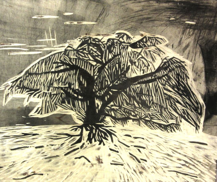
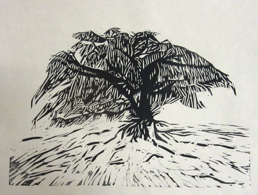
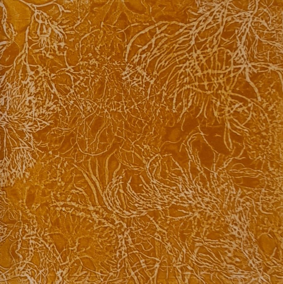
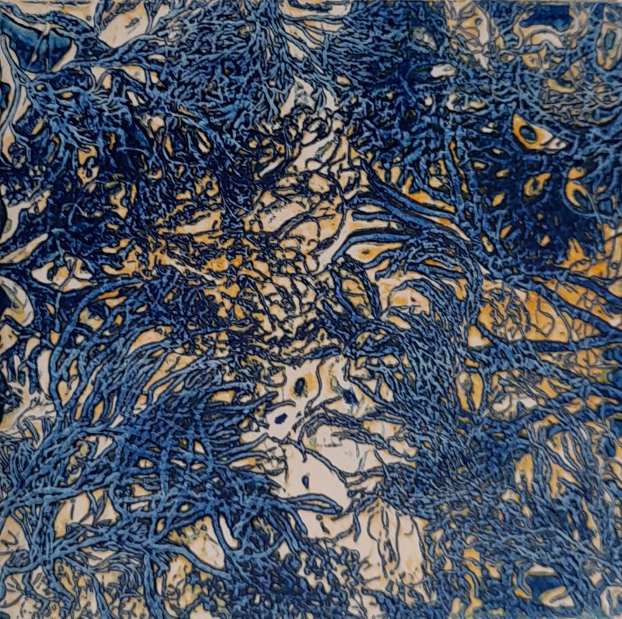
 Lisa Takahashi – Dynamic woodcuts prints
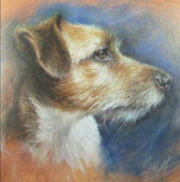
Lisa demonstrated how she uses various blades to reveal the design and what can be achieved with inking in different ways. A very entertaining evening.
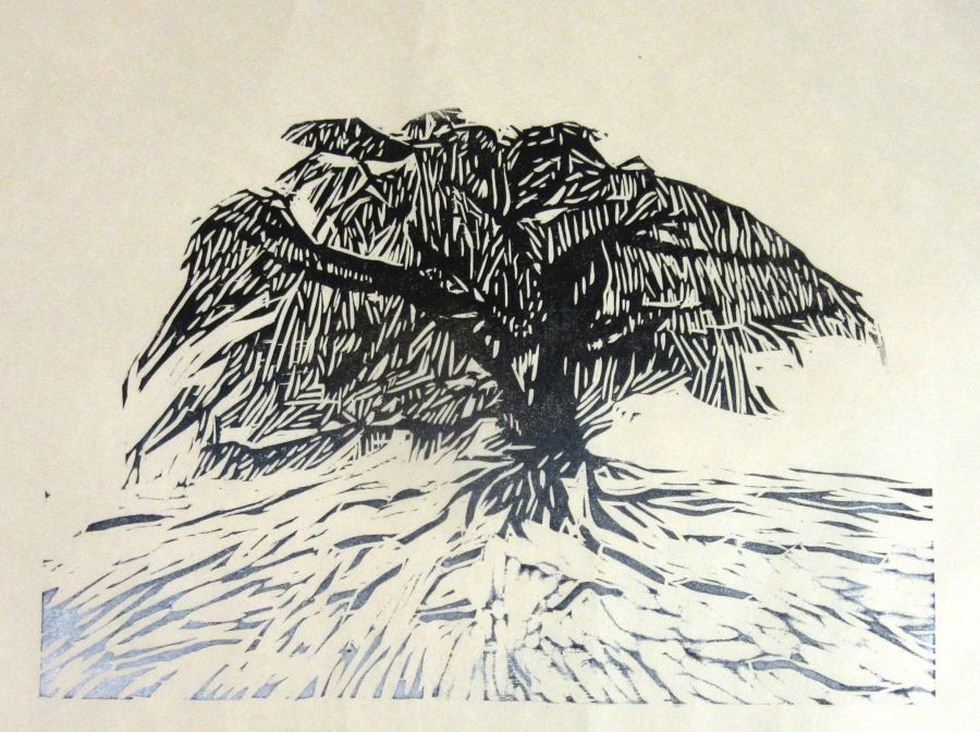
Lisa’s website is: https://www.lisatakahashi.com/
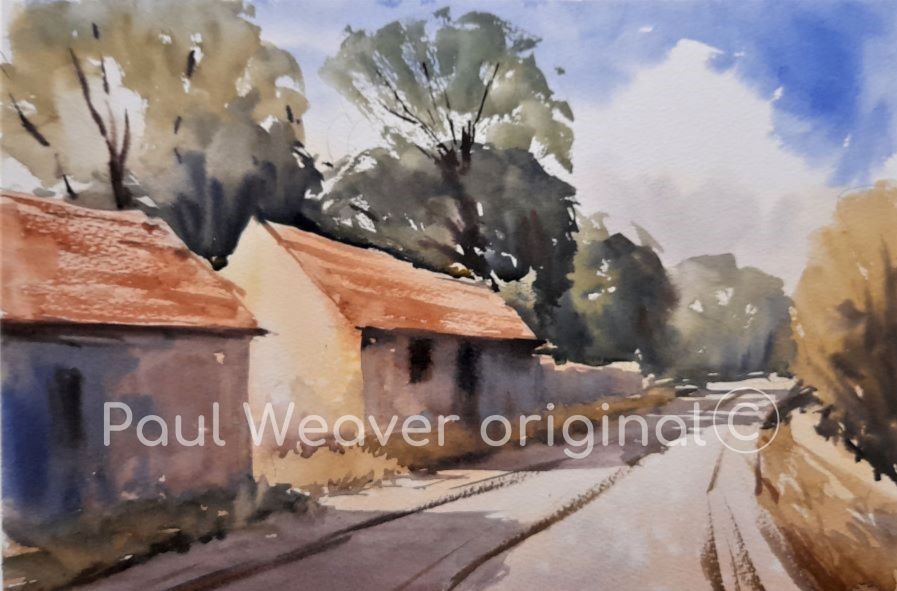
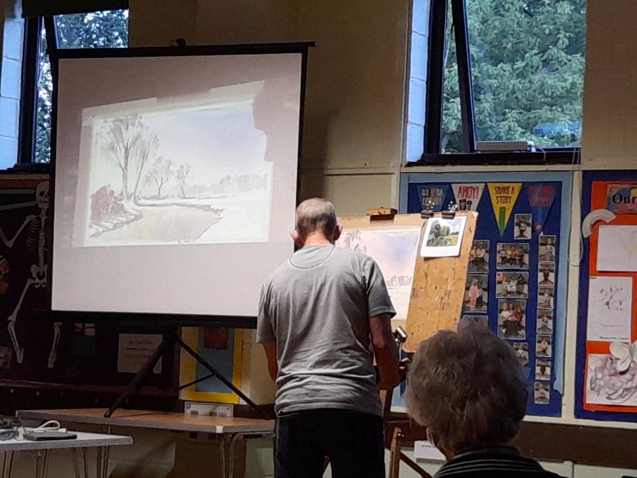
 Paul Weaver – Discovering subjects through sketching and drawing
Another smashing demo from our resident artist Paul. Guiding us through on how to find shapes through sketching and drawing. Lots of questions asked.
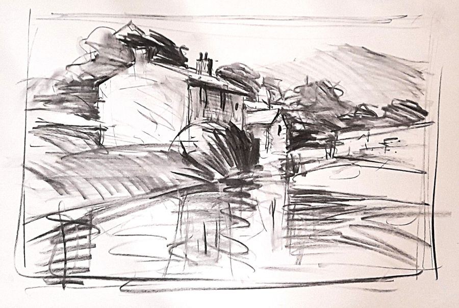
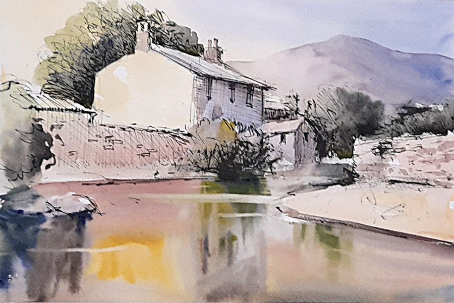
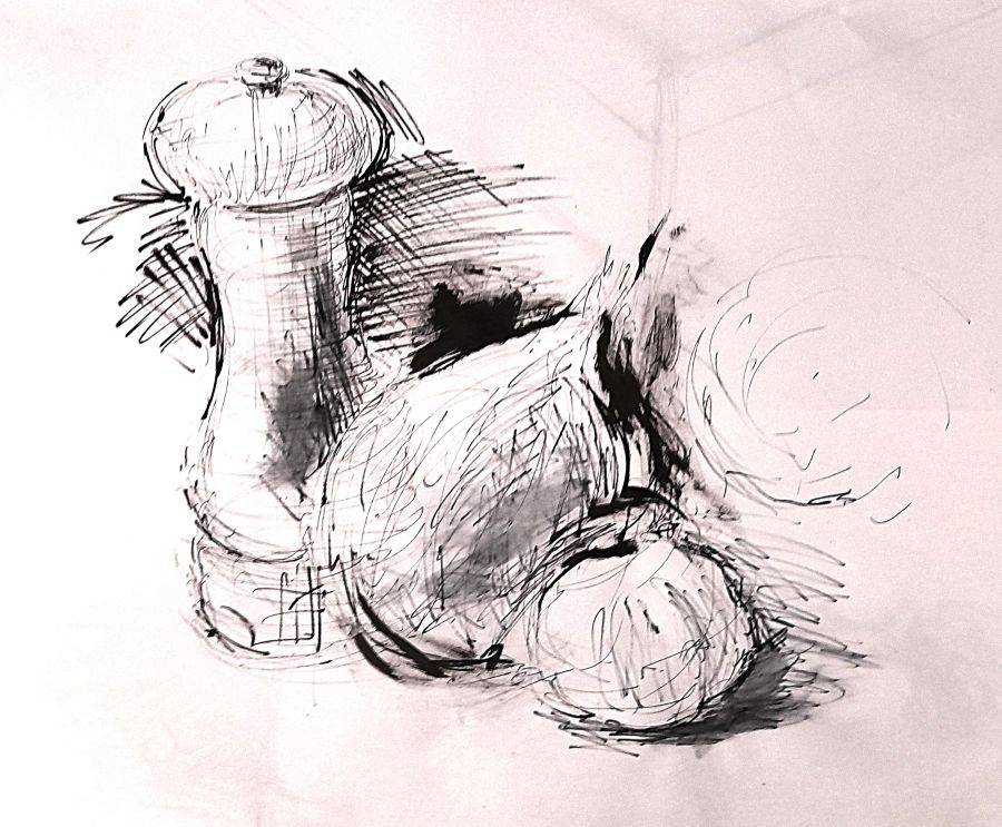
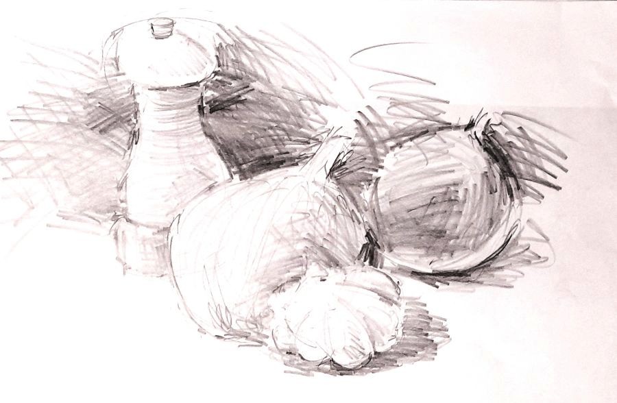
Paul’s website is: https://www.paulweaverart.co.uk/
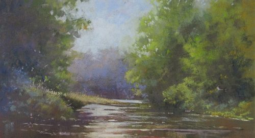
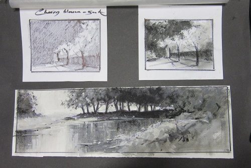
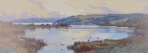
 Catherine Beale – Wetlands Ham Wall nature reserve
Catherine showed us again her atmospheric style of painting of this interesting subject.
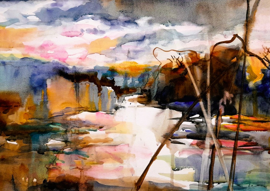
Catherine’s website is: https://catherinebeale.com/
 Anna Brewster – Summer Flowers
Anna showed us how she draws her wildflowers using permanent ink and then add colours using water colours or acrylic ink. It was really interesting to see how Anna built her composition and the use of colours in her artwork.
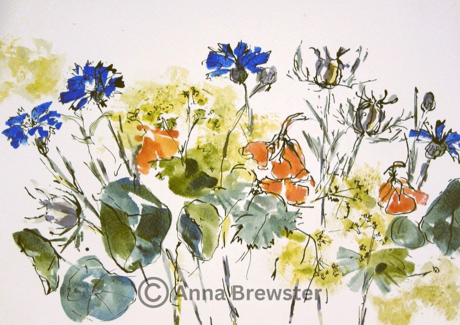
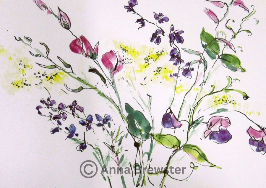
Anna’s website is: https://www.annabrewster.com/
 Annie Musgrove – Looking beyond the gorse and bracken
Annie guided us through her style of painting with oils and palette knives. It was interesting to see the background and foreground of the painting appearing out of nowhere. A very interesting demo.
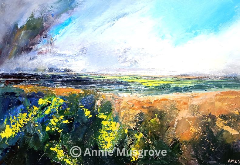
Annie’s website is: https://anniemusgrove.co.uk/
 Stephen Jenkinson – Exciting techniques with acrylics
Stephen demonstrated various techniques to create his textures. It was interesting to see what different colours and techniques on top of eachother could create. And some members where very lucky to been given some of the work he created at the demo.
Stephen’s website is: www.somersetartworks.org.uk/artists/stephen-jenkinson/
 Alex Boon – Nature Journaling
Nature journaling is the act of creatively recording your relationship with nature (quote from Alex’s website). Alex walked through his journals and showed us the various stages he went through from very meticulous drawings to a looser style of drawing and painting and less text using inktense pencils and pans from Derwent. Besides his journals he also created the illustrations for the Undercliff nature reserve map in Devon. Quite a different demonstration but we definitely enjoyed the work of this very talented artist.
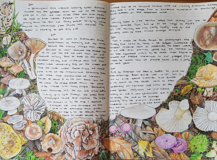
Alex’s website is: www.alexboonart.com
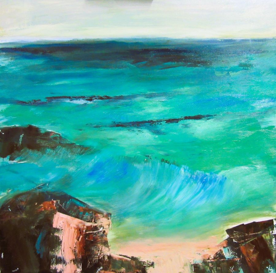
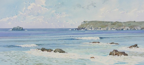
 Julie Dunster – Seascape with plein air approach
Julie painted an enchanted picture of 2 girls on rocks. She started with a loose approach to painting the sea and rocks and then added the details. A thoroughly enjoyable demonstration. Julie answered many questions of our members and visitors.
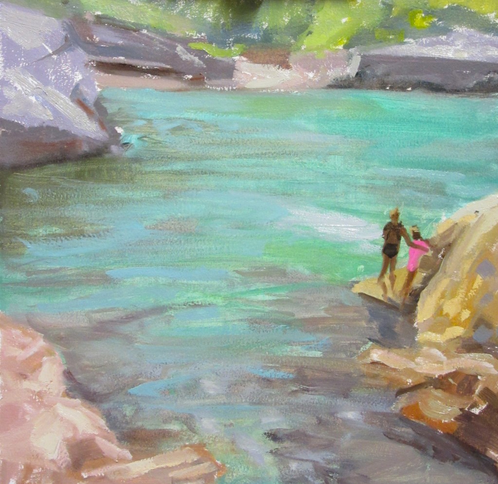
Julie’s website is: www.juliedunsterartist.com
Catherine Beale – Atmospheric watercolour landscapes
Another great watercolour demonstration. Catherine showed us how she prepares her boards and how she add colours to create her atmospheric watercolour landscapes, then use water to dilute areas and remove the colour to create misty landscapes with sun rays breaking through. Catherine was very knowledgeable and answered many questions. Thoroughly enjoyable evening.

Catherine’s website is: www.catherinebeale.com
Lisa Takahashi – Exploring summer gardens
Lisa guided us through how she plans and design her composition, she mainly paint a plein air but makes many sketches if she need to finish her work at her studio. She put down light washes of various shades of green and make them stronger where the shadows appears. Then add block of bright colours and dim down the brightness with more greens. Lisa was very chatty and we enjoyed her demonstration.


Lisa Takahashi’s website is: www.lisatakahashi.com
 Belinda Reynell – Rocks in seascape
Belinda added bright colours as her background, she then uses zinc white as a glaze to add the skyline. Then uses light green & sallow turquoise to add some colours in the sea all this added with rags. Using Burned Umber, Titanium white and cold wax she adds the rocks with a palette knife. The cold wax gives the rocks its texture. Creating a sea green with Prussian Blue and Cadmium Yellow to add to the waves and the skyline and work towards the sand, this time using a brush. Add Titanium White for the tops of the waves and finish with making splashes where the sea hits the rock. As usual an interesting demonstration.
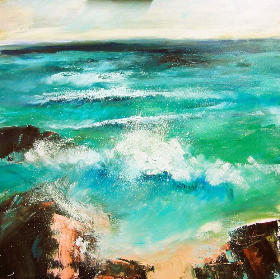
Belinda’s website is: www.belindareynell.com
 David Wilsher – Venice Scene
David started with a light wash of burned sienna to get rid of the white background. He then uses a thinned burned umber to sketch his landscape. He removed some boats from the photograph to suits the composition. He starts with a wash of colours for the background then start adding blocks of colour in the sky and buildings. He then start working on the boats with shapes and shadows using black and indigo, then finishes with bright white highlights on the water. It was a fab demonstration.
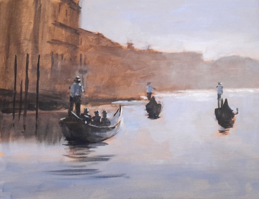

David’s website is: www.davidwilsher.com
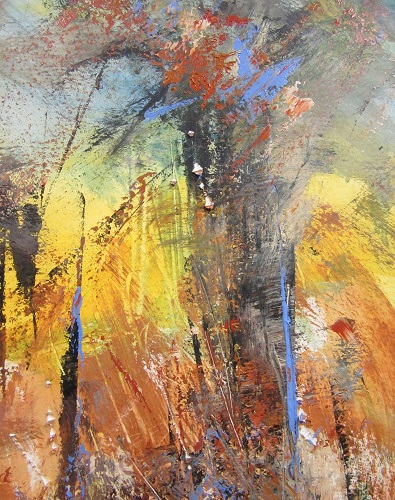
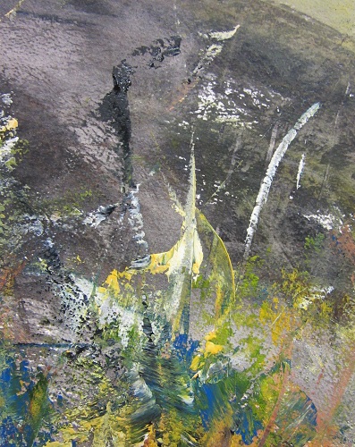
 James Tatum – Landscape as power & emotion
James guided us through how he sees the landscape and created some interesting artworks with every day utensils. It was great seeing something special coming out a black brushstroke, splashes and highlights of blue paint. The demo was very entertaining and all our visitors enjoyed the process of creation.
James’s website is: www.jamestatumartist.com
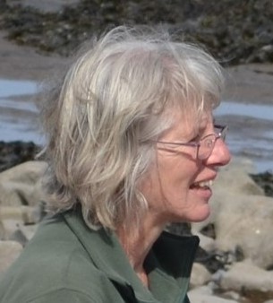
 James Budden – Portrait painting without fear
This was a very interesting demonstration, James started with a wash and then uses a rag to remove the paint to create the first stages of the portrait. He then start to add sensitive skin tones to built up the layers and add details to the portrait. It was great to see the face appear in front of your eyes.
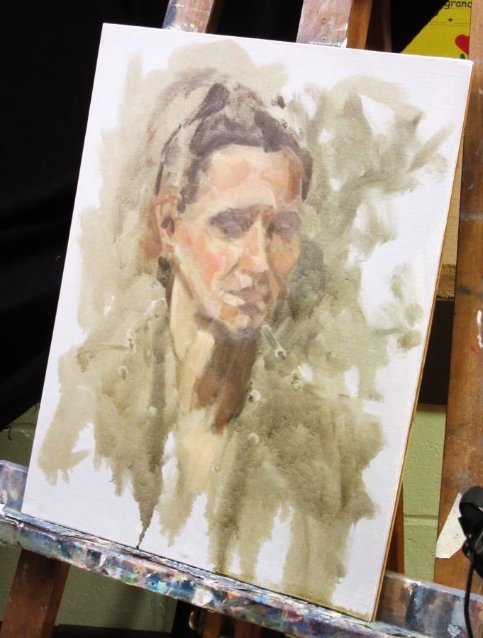
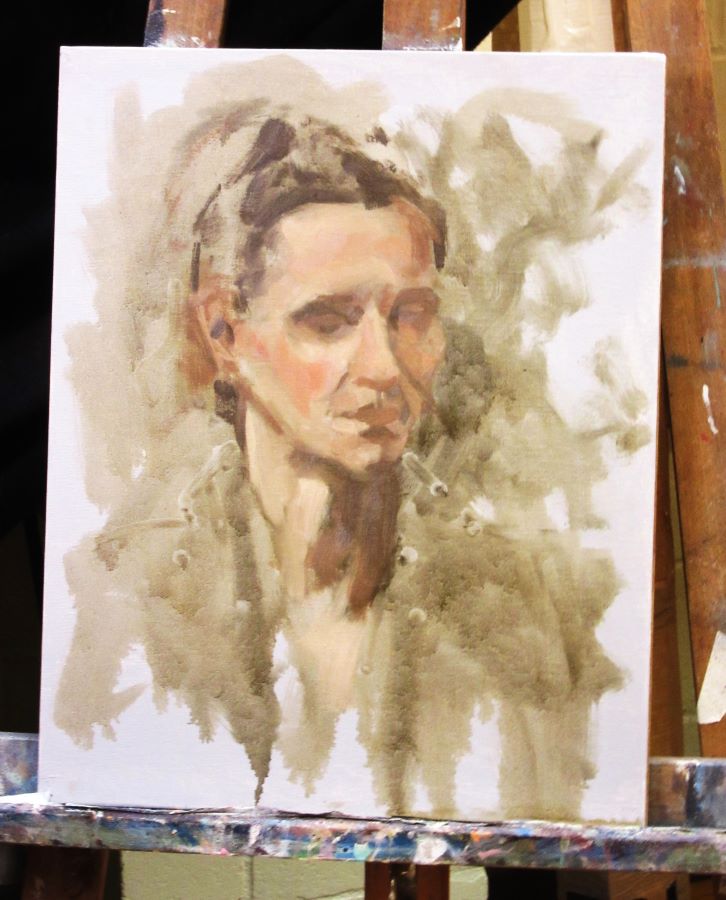
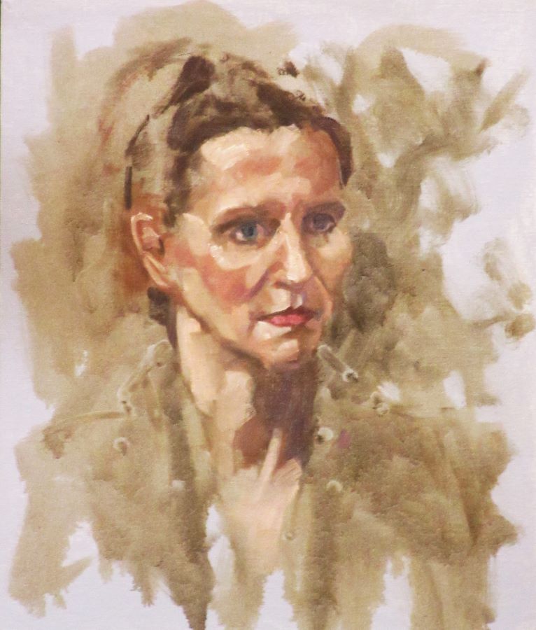
James’s website is: www.jamesbudden.co.uk
 Jackie Curtis – Foil plate prints
Jackie made some printing plates using cardboard, plants and aluminium foil. It was very interesting seeing the different printing effects she created. The more times she used the printing plate the more details she got but only limited prints can be taken before the plants get to flat to create any details. It was an interesting process and we enjoyed ourselves very much.


Jackie’s website is: www.jcurtisart.com
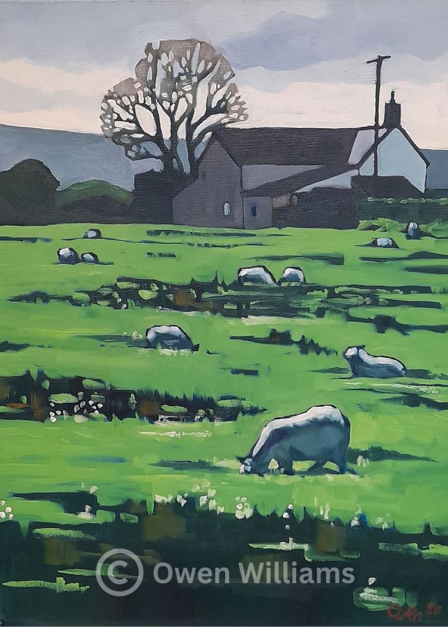
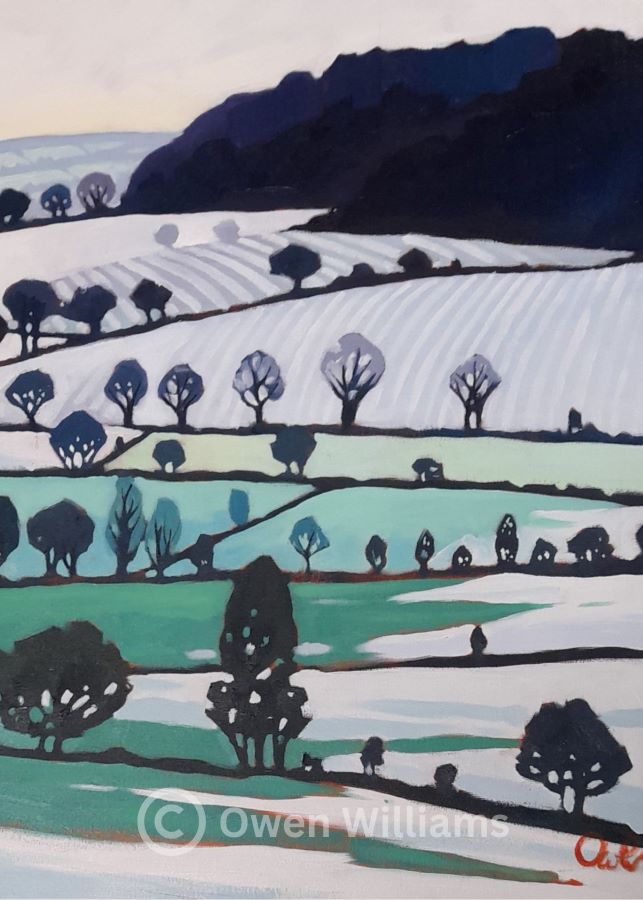
 Owen Williams – Landscapes
Owen showed us how to create a landscape using negative spaces. Starting with a red background adding darker colours for scrubs and trees and then adding various shades of green. Many questions were asked and we were worried Owen would not finish the artwork as he was so engaged in answering all the questions from members. Owen is doing a workshop for us in April 2024 so keep an eye for that one.
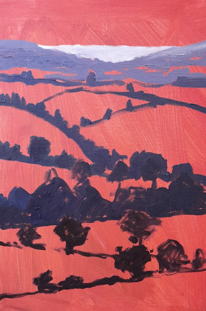
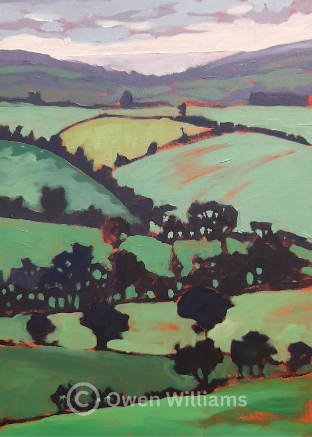
Other work of Owen – his website is: http://www.owenarts.co.uk
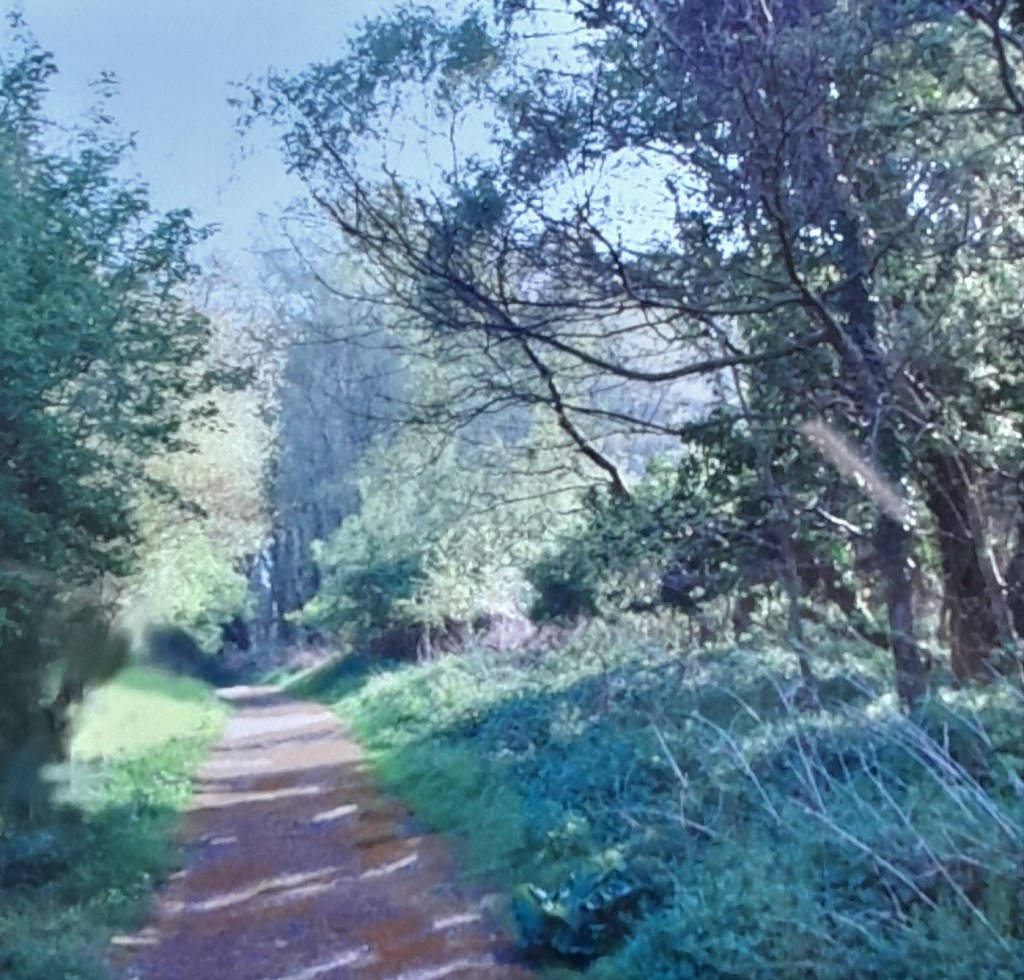
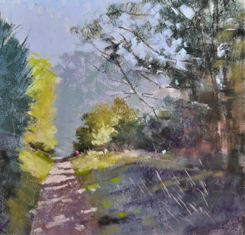
 Neil Whitehead – Urban landscapes
Neil is deeply inspired by the cities and towns where he lives and works. He is always seeking new ways to capture the energy and character of the city in his art. Neil sketches his environment in a continuous line and infuses them with strong tones, rapid mark making, and negative space to create dynamic and expressive urban scenes. It was a great workshop. Neil is doing a workshop in September, although fully booked we take reserves in case of cancellations. Email enquiries@tauntonartgroup.com or speak to Mavis/Ilse at the next demo/workshop.

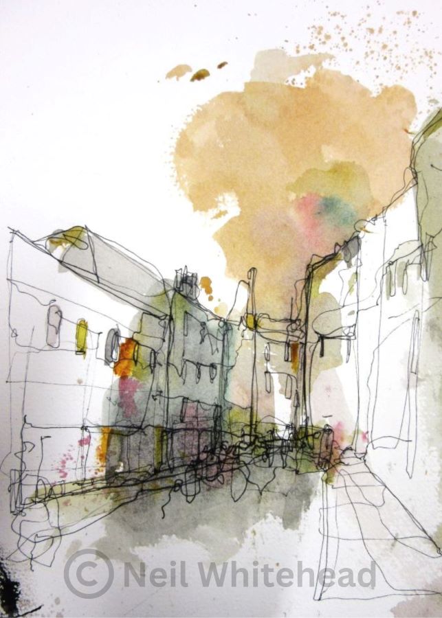
Neil has some tutorials on his website, so go and have a look – www.neilwhitehead.co.uk
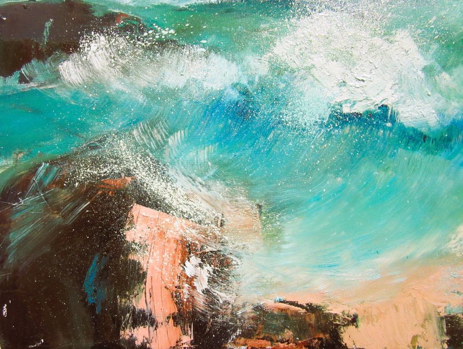
Belinda Reynell – Paint texture in a seascape
Belinda showed us how she prepares her backgrounds for her seascapes using Yellow Ocre and Burnt Umber or Burnt Sienna and a rag to mix these colours on the canvas. Adding some Prussian blue for the landmass at this stage just using a rag. To add some lighter areas, Belinda use zinc white as that is less opaque than Titanium white and add more atmosphere to the art work. Using Titanium white and some Ultramarine Blue and a palette knife to create her dynamic sky making sure to leave some of the background colour untouched. Then uses some scraping tools to create texture in the sky and sea. It was a brilliant demo, very relaxing and knowledgeable.


Belinda’s website is: www.belindareynell.com
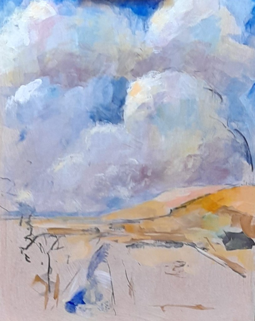
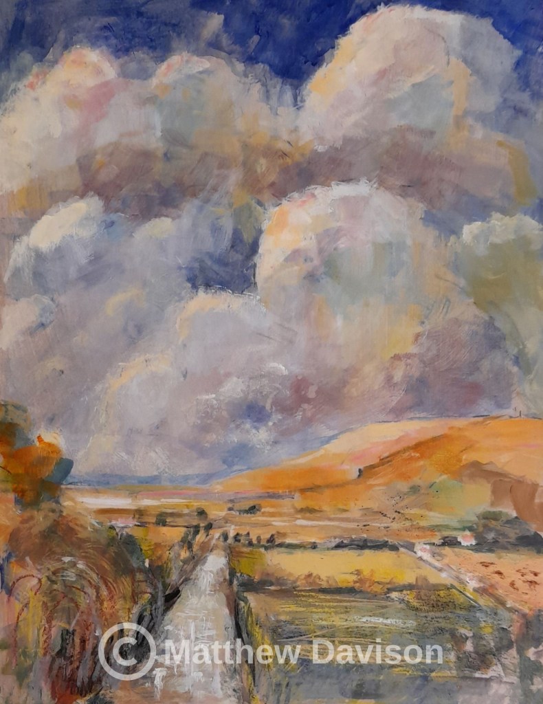
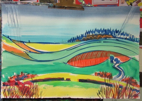
 Matthew Davison – Clouds, light & landscape
Matthew engaged his audience by asking what they wanted him to paint so we decided on the Somerset Levels in the afternoon with a murmuration of starlings. Matthew started with drawing a sketch using a few lines to indicate the landscape. Then proceeded to paint the sky with vigorous brushstrokes not worrying too much about details. Adding a bit of the background and darkening the colours to emphasise the colours in the sky. Proceed with the foreground and finish with conte crayons to add some detail in the fields and edges of the water. Add some splashes of black for the murmuration of starlings.
 Christine Russell – Poppy fields in pastel over acrylic ink
Christine starts by covering the surface with acrylic inks before adding pastels over the inked surface. Leaving some of the background undisturbed she starts with the sky and create the village in the background using various colours of blue. Creating a focus point with the trees mid foreground and finishes with the poppies leaving a lot of the pink/purple created with the inks shine through. It was a very interesting demonstration using various mediums.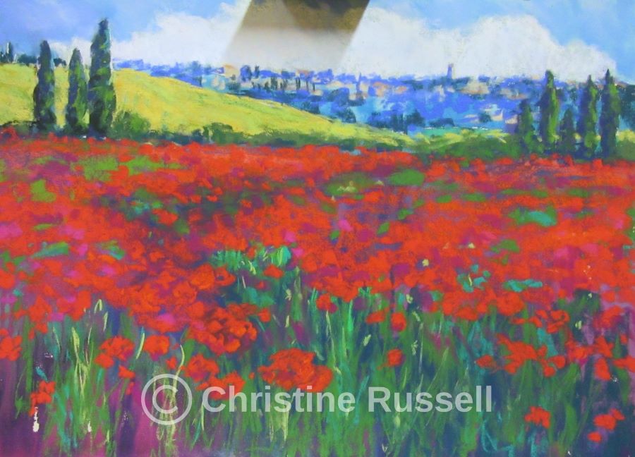
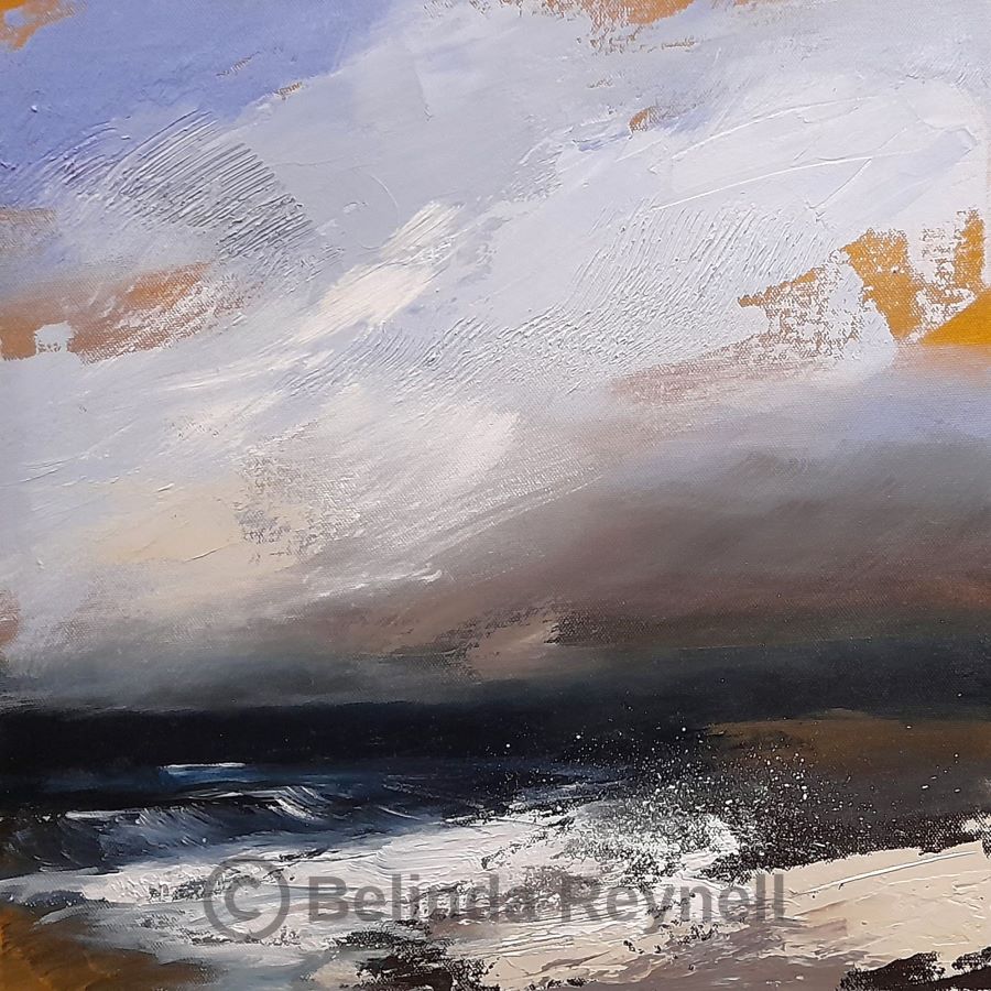
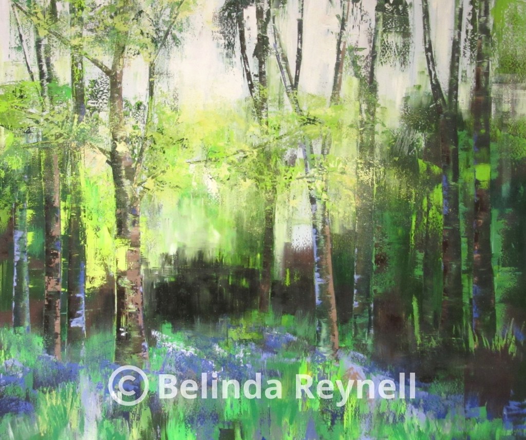
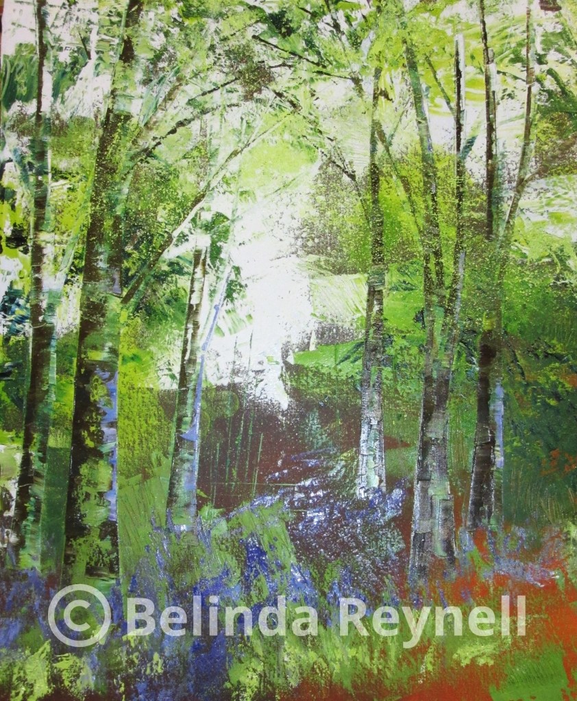
Belinda Reynell – Treescape with blue bells in oil
Belinda demonstrated how to make a treescape in oils. She starts with a prepared box canvas covered with Burned Sienna and Burnt Umber. She used a limited palette of various yellows and blues to create greens, brown and in this case purples for the blue bells mixed with cold wax and other mediums. She uses metal scrapers to create tree trunks, background and foliage. She uses palette knives and brushes to create textures in the trees and foreground. It was a really engaging demonstration.
Belinda’s website is: www.belindareynell.com
 Hayley Webb – Textured ceramic plaque
Hayley showed us how to use everyday items to create interesting textures on clay. She used 3 different clay thicknesses to create a 2 dimensional sculpture on the plaque. Hayley then used underglazes to add colours. This can be done when the clay is wet or when it had a bisque fire (clay turns white after first firing). Many questions were asked and answered. A very interesting demonstration from Hayley.

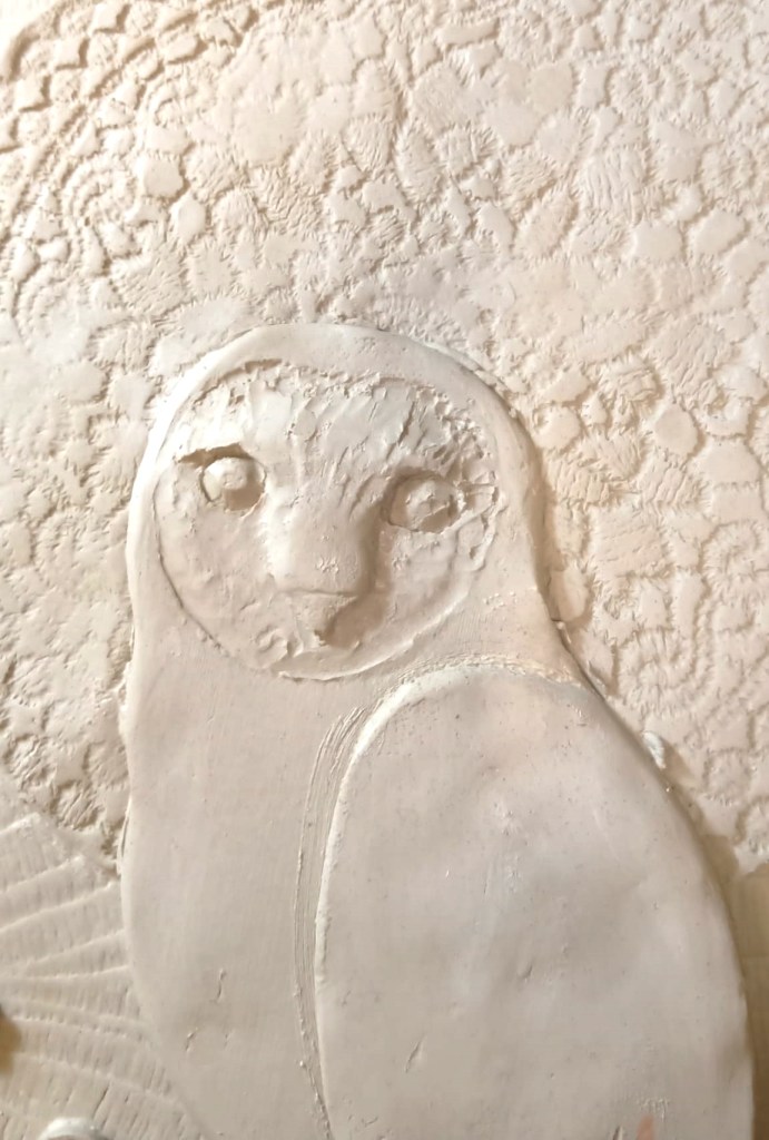
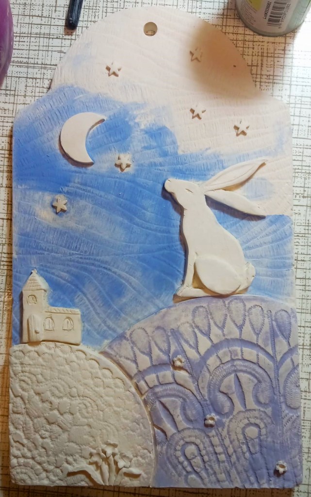
Hayley website is: www.blueharestudios.co.uk
 Richard Turner – Pastel over watercolour landscape
Richard gave us an demonstration on using pastel with a watercolour background. He starts with a black and white tonal sketch before using colours. Richard start with painting the darker colour blocks in watercolour, he always looks at the picture in its whole so not necessarily works from left to right. Painting tone in tone is important for him. By using watercolour prior to adding the pastel you can create accidental effects. He uses hard pastels for the background to get finer lines, softer pastels for details and layering. He uses different techniques ie gradation which is visually appealing, he prefers not to blend his pastels as that will only solidify a block of colour which is not what he wants. To get darker version of colours, Richard will add black first and than the colour he wishes to make darker. For Richard the painting is about the process not the painting itself, it allows him to be more experimental.
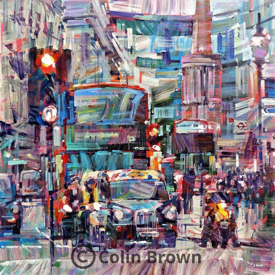
 Colin Brown – London scene in acrylics
Colin likes to paint his subject upside down so he can concentrate on shapes rather than images. He mixes his colours on the brush to create accidental colours once applied on the board/canvas. He uses lines to accentuate architectural designs then fill them in with different colours but in the same style. It was really interesting to see the subject appear from all the different colours and shapes on the board.
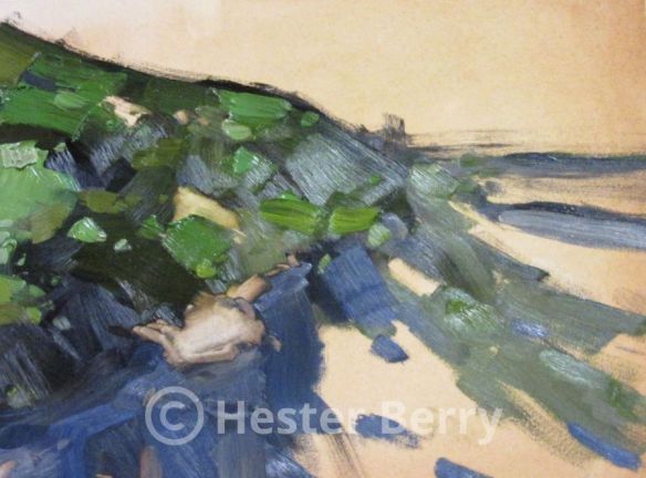
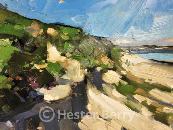
 Hester Berry – Landscape in oils
Hester gave us an interesting insight in her method of painting, using brush strokes economically and observing each shade of the colours of her subject. She doesn’t use printed photos as that doesn’t reflect accurate colours, she used her camera throughout the painting. She will make tonal sketches for composition purposes in situ but doesn’t usually paints en plein air. She starts with blocking in dark shades and shadows and then start adding the different shades and hues of the different colours. She uses her brushstrokes to distile the feeling of the moment into what is necessary.
 Paul Weaver – Seasonal landscapes in watercolours
Paul gave us a lovely demo painting a Summer and Winter landscape. He started with a tonal sketch to arrange the composition and remove anything he felt would disrupt the flow of the painting. He would only use 2 washes, the first wash covering most of the painting, the second to bring in the details, most done wet in wet. Paul used a size 30 Rosemary brush to do the whole painting. This is the subject we will be painting at the workshop on the 11th of September. We still have places left so hurry if you would like to join us & Paul at this exciting workshop. We enjoyed the demo in rather strange circumstances with social distancing & masks on but members were just happy to meet up again. Thank you for all of you that ventured out to join us.


Paul’s website is: www.paulweaverart.co.uk
 Roy Lang – Rough seas at night in oils
He started by talking about his canvas on which he was going to paint a moonlight seascape. Checking that the frames were square and not twisted or buckled. Roy had prepared his canvas with blocked out areas of black gesso (which can be purchased or made yourself) to give a base for the oil paints used for the rocks and features. Ray uses a mop brush to blend his tones, using small circular movements. If you have a busy sea create a plainer background so they don’t clash. The moon was not in the picture, but its known position influenced the highlights on the canvas. As the painting progressed his talk was well peppered with anecdotes and jokes causing much amusements. As the painting progressed we were told what colour was being used and how they were mixed to get just the right shade for the breaking foam and the wet rocks. At the end we were pleased to see the moon light dancing on a breaking seascape.
Roy’s website is: www.roylangartist.com
 Gregory Wellman – Portrait in pastels
Gregory is a self taught artist in various mediums, ie pastel, acrylic, watercolour and oils. On tonights demo Gregory will shows us how to draw a portrait in pastels. He uses Unison pastels on Daler Morano paper and does not use any fixatives as he feels a dry medium and wet fixative do not mix together. He will work from photographs where he will look for tonal values and natural look on the face, he does however prefer to draw from life models. Gregory starts with drawing the face in charcoal or use pastel pencils. Once the portrait is on the paper, he will on occasions use an acetate to copy the main features in case he looses the likeness further down the process. Gregory starts with the darker areas, blocks in areas before blending. Treat hair as a landscape, think of blocks of hair rather than draw individual strands. He will use various colours for the hair, ie dark grey, greens and blue. As eyes are quite small he will therefore use pencils to block in the colours. Clothes are important so don’t leave them to last, they’re an integral part of the portrait. For skin colours, Gregory start with lighter colours (light flesh tint) placing down large areas. Use darker flesh tones for darker areas. He uses broken green/blue to cool down pink colours and uses brown for dark shadows. Darker colours blended with warm colours will appear closer. Gregory will make marks to follow the contour of the face but not always, it depend on the face. Lips are drawn as a little plan, you need to observe them to make sure they are constructed correctly. Gregory uses blocks of pastels as they are making more impressionistic marks than pencils but with blocks you can lose details which you don’t with pastels pencils.

Gregory’s website is: www.gregorywellman.com
 Kate Turner & Richard Welch – Acrylic flow painting
Acrylic flow painting is a technique where you mix cheap acrylic paint with a pouring medium and silicone to create different patterns and cells. You pour different colours mixed with the pour medium and a few drops of silicone oil in a container. Because of the pour medium the colours won’t mix in the container. The container will then be flipped upside down on a canvas, leave it on the canvas for a few minutes then remove the container letting the paint pour on the canvas. You can them move it around by tilting the canvas in all directions. The silicone is oil based reacting with the water based acrylic paints want to float to the top through the different layers of acrylic paint creating cells. Extra cells can also be create by using heat – ie blow torch (no hair dryer as that will blow the paint off the canvas). This is called a dirty pour; you can do a clean pour where paints are mixed with the pour medium and silicone oil but not put together in one container before flipping them on the canvas. You can also do a dirty pour without the silicone to create interesting patterns without cells also called a swirl pour where paint is poured in circular motion. Kate & Richard finished off the evening with a swipe pour where you firstly cover the canvas with a single colour (white in this instance) mixed with pour medium but no silicone oil. Richard then dropped different colours mixed with the pour medium and silicone oil over the canvas. He pours white paint mixed both with silicone oil & pour medium to one side of the canvas and then uses a cardboard to swipe the paint over the coloured drops. As the silicone oil moves to the surface it creates beautiful cells. It was a very interesting and entertaining evening.
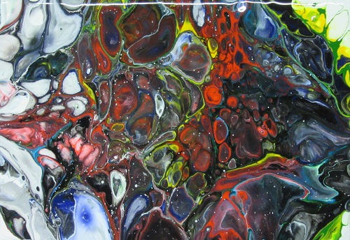


The painting takes about 3-4 days to dry, you can then add a second layer with a design. Richard like to turn around the painting looking for shapes in the pour to decide what to paint in the second or even 3rd layer.
David Wilsher – Rainy evening in acrylics
David had a successful career in a variety of artistic disciplines. For several years he was a portrait sketch artist on the Greek island of Corfu. Then he became a signwriter and developed a reputation as a pictorial, fairground and mural artist. David’s palette is quite limited to yellows, reds, blues and a range of browns to black. For tonights painting David prepared a canvas with a base colour of burned umber, he prefers the background colour not to be too bright. He uses an airbrush medium to mix his acrylic paints as using too much water breaks down the pigment in the acrylic paint. David works in plein air but also uses photo’s. David starts to sketch with paint to get the composition he likes, at this stage there are no details. After the rough sketch he starts filling in areas with colour. Be aware that acrylic paint dries darker so don’t make your colours too dark. He uses very thin paint to fill up areas and has to make sure to put the reflections in all the right places. For the street lights he uses burned umber, cadmium yellow, Naples yellow and titanium white. He paints the street without defining sharp edges to give suggestions of shapes which comes with practice. He doesn’t always paint everything in the photograph unless it’s a well known scene (like the streets in Topsham where he lives). He sometimes makes things up but the drawing has to be correct. By not having a detailed drawing it maintains the interest in the painting, keeps it exciting which is hard to do but again that comes with experience and practice. In tonights demo David didn’t like the figures in the photograph as they were too dominant so he changed them. To make figures use google and enter silhouettes, make sure the figures are at eye level. 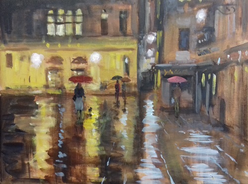 Finished painting
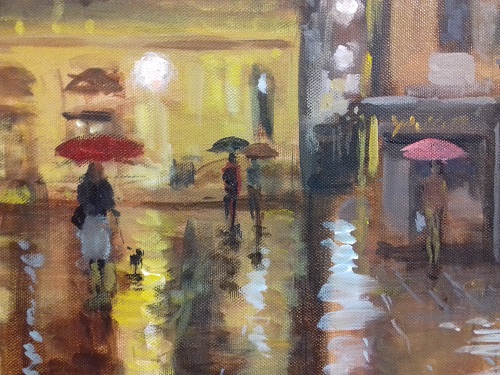 Detail of the finished painting
David’s website is: www.davidwilsher.com
 Kaili Fu – Chinese brush; bamboo landscape
Kaili uses the freehand style Xieyi, she paints the foreground first which is quite different from working with watercolours. She will then create the landscape through the bamboo, using very little ink to give an impression of shapes. Ink gives Chinese painting a distinctive characteristic. Traditionally the ink sticks are rectangular in shape and made from pine soot and resin, mixed with herbs. However prepared liquid inks are now available. Kaili uses paints to mix with the ink to create subtle colours. The paper used for painting is called Xuan paper, known in the West as rice paper. It is fine, soft, long-lasting and made from a variety of materials, such as bamboo, mulberry tree bark, rice straw and rattan. The skill is in the control of the waterflow from the brush, it takes several months to paint bamboo correctly but once you paint bamboo well you can do everything else well. Kaili uses a felt base for her rice paper drawing as it absorbs the water and prevents the ink from spreading. Once the painting is dry, another sheet of rice paper will be attached using wallpaper glue to give it strength, as ink is used the glue won’t spread the colours. Kaili then proceeded to paint peonies, Kaili uses white paint to mix with her pinks. She loads the brush with colour and use pressure to make different tones in her flowers. There are two main brush types, white hair and brown hair. White hair brushes are often made from goat hair. Being comparatively soft and absorbent, they are used for flower and bird paintings and for colour washing. Brown hair brushes are variously made from weasel hair, horsetail hair, human hair, pig bristles or bird feathers. They are stiffer brushes, suitable for contouring and used in the painting of tree branches, bamboo and landscapes.
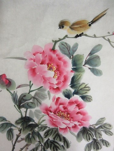
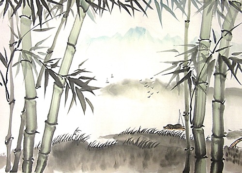
Kaili’s website is: www.kailiart.com
 Marilyn Allis – Big brush impressionism
For her demo tonight Marilyn uses 2 very big brushes size 30 and 16, most of the painting will be painted with the size 30 brush. Marilyn starts with a very diluted wash of French ultramarine blue, burned umber & lemon yellow, she uses a 190gsm Saunders Waterford paper and SAA watercolour tubes. The background is painted very loosely, removing any drips that might appear. She then add raw sienna for the ground still keeping it very diluted just giving it a hint of colour. She then starts with the the lady in the foreground, concentrating on the light and dark values of the figures. Marilyn is not worried about painting features she just wants to paint light and dark. She brings the painting together with shadows using burned umber and Prussian blue. The colours she used in this painting are Prussian blue, sepia, cobalt blue, raw sienna, mauve, vermillion yellow, burned sienna, French ultramarine blue and orange. Once all the colours are dry she will remove the pencil drawing to make the painting even more impressionistic. 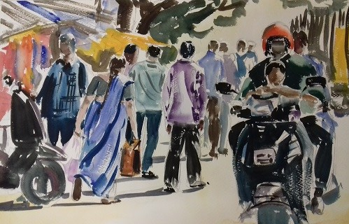
For Marilyns second painting, she will only use 2 colours Opera rose and Dorset blue. She starts with a diluted wash of Opera Rose for the background partly painting over the pencil drawing of the zebra. She then uses Dorset blue to paint the stripes and add the shadows in the zebra.
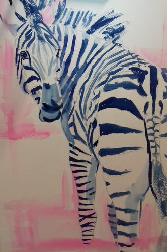
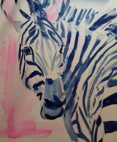
Marilyn’s website is: www.marilynallis.com
 Jo Turner – Calligraphy, gilding & signwriting
Summary:
Jo is a calligrapher, sign writer, illustrator, woodcarver, artist & publisher. Jo loves anything creative this started in primary school when given an exercise book. Jo was influenced by family members who were artists in their own right. She left school and went to Sussex College of Art and Design to be told she was colour blind, none of the courses available appealed to her so she decided to teach herself doing short courses. She joined the Sussex Scribes and with her mentor the late John Shyvers became an adult education tutor taking over his classes. Her first works were monochrome location maps with calligraphy and illustrations and visit cards. Her signs encompass lettering and illustrations, Jo sketches her designs in chalk on the sign before painting as it’s easy to remove after finishing the design. She uses a very stylistic style for her illustrations. She also found a love for wood carving, being lettering or illustrations. Jo’s main tools are layout paper, parallel rulers ie makes drawing lines for writing very easy, dip pens with slide on containers, propelling rubber, propelling pencil and various pens and nibs. She uses a sloping surface so she can see the point of contact between pen and paper. There are several pens on the market, ie Pilot selling pens with nibs. She mainly uses Quint/Parker ink but has also makes her own ink from oak gals which gives lovely shades of colours but it’s a long procedure to make the ink and not for the faint hearted. For her examples of white lettering, Jo uses white gouache as that is easy to dilute and will dry opaque.

Jo’s website is: www.joturnercalligraphicartist.org
 Rob Walker – Pen, ink and watercolour wash
Summary:
Rob was a graphic designer and illustrator and running his own design business in the Midlands. He moved to the South West some eight years ago to pursue a more relaxed lifestyle and discover the beauty and freedom of this part of the world. Born and raised on the farm, the countryside and rural scenes, people and animals are a big influence on Rob’s work looking to bring life and energy to his paintings. Rob draws his subjects quickly and loosely with a biro pen, not going into a lot of details, it has to be quick and spontaneous. He paints in 3 or 4 colours, cadmium yellow, cerelium blue, paynes grey & light red. He uses 300mg Bockingford cold pressed paper that doesn’t need stretching. At tonights demo Rob painted a blue tit, he starts with a biro drawing adding cadmium yellow & a little ocre for the chest, he will sketch with the paint, even slap it on. He doesn’t paint within the lines. Next he uses cerelium blue and paynes gray for the plumage of the body, it’s all about contrasts, he’s happy for colours to blend from light to dark. Rob uses a size 12 brush for most of the painting and a small size 2 rigger for the details. He will then use acrylic ink (sepia not black) to make random lines to make the painting animated and make highlights like the eye of the bird. Rob finishes his painting with pastels to add dynamism.
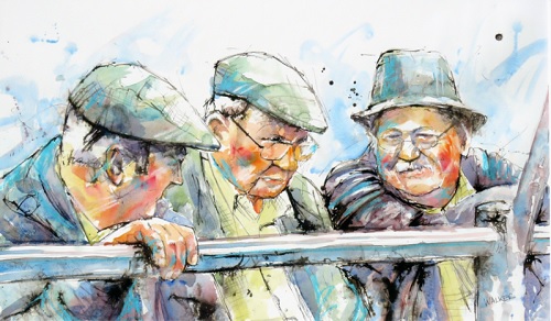
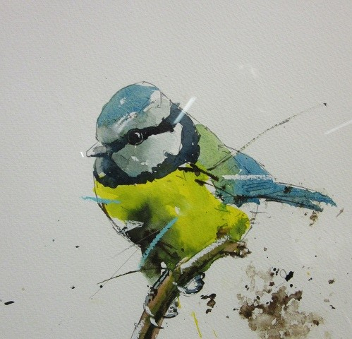
Rob’s website is: www.robwalkerartist.co.uk
Richard Turner – Still life in pastels
Summary:
Richard gave us an demonstration on using pastel with a watercolour background. He makes black and white tonal sketches before using colours. He uses UART paper which comes in 8 grades. Richard start with painting the darker colour blocks in watercolour, he always looks at the picture in its whole so not necessarily works from left to right. Painting tone in tone is important for Richard. By using watercolour prior to adding the pastel you can create accidental effects. He uses hard pastels for the background to get finer lines, softer pastels for details and layering. He uses different techniques ie gradation which is visually appealing, hatching which he doesn’t use a lot in his paintings, he prefers not to blend his pastels as that will only solidify a block of colour which is not what he wants. Richard sometimes uses underpainting to give different effects to his painting, ie with different mediums like gouache. To get darker version of colours, Richard will add black first and than the colour he wishes to make darker. For Richard the painting is about the process not the painting itself, it allows him to be more experimental. Richard gave us a short demonstration on how to make your own pastels, which is useful to make any colours you like and are not readily available or very expensive. When Richard want to make any corrections he scrapes off the pastel using a blunt Stanley knife so he doesn’t damages his paper. He uses a Sharpie pen to make his tonal sketches which can easily be drawn over by pastel. He doesn’t use fixative on the finished painting but sometimes he uses it to fix an area he wishes to work on. Richard uses an app on his tablet to try use different colours before actually using the colours on his painting. The app is called Brushes redux but is only available on Apple devices.
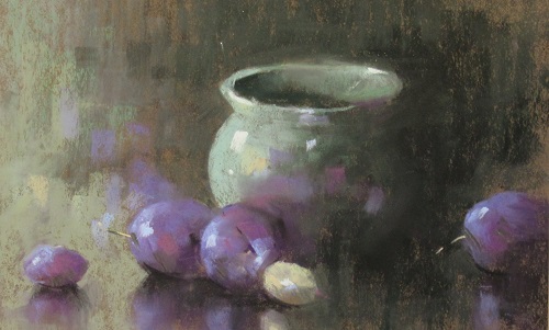

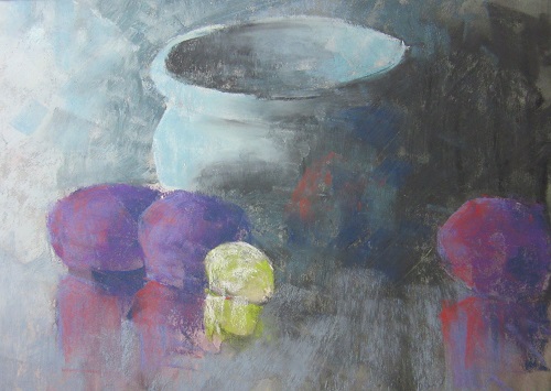
Richard hasn’t got a website but is happy for members to email him if you have specific questions. His email address is rstuartturner@aol.com. Click here for instructions to make your own pastels.
 Mark Gibbons – Seascapes in Watercolours
Summary:
Mark prefers to paint in Plein Air and will spent hours on the beach painting. He uses particular methods for his painting; he will use masking fluid for waves and highlights. He paints light zones then the darker ones, this is to avoid the creation of blocking zones and overlaps. He uses a S-curve for the flow of his painting. He uses cobalt blue and turquoise in the sky using the wet in wet method and will use cadmium red to warm his blues. He uses his brush to remove excess paint rather than a tissue. He prefers to paint in the letterbox style 22cm x 10cm which is ideal for seascapes. He uses indigo, cobalt, viridium and purple for reflective seas and land masses. For areas close to the shore he will use flashes of turquoise for sea on sand he uses purple all the time softening edges. For vegetation he will use cereleum blue, burned umber, for rocks cobalt blue, burned sienna to create greys. He will always run colours in each other to avoid edging. For the sand he uses burned umber with lots of water add a bit of cadmium red for the foreground and purple for sand further away. For seaweed he uses reds and blue with burned umber. Mark starts with drawing to pin down the shapes of shadows as the light will change quite quickly. When he is finished he will erase pencil lines and remove the masking fluid with a putty rubber. He uses his smallest brush (Kalinsky number 3) for details and soften waves in the distance using grey, putting darker colours under the waves. For shadows he uses dark green/grey and lifts paints for light effects using a stiff oil paint brush. He uses a Bodingford 140 pound paper and Winston & Newton watercolour paints.

Mark’s Website is: www.gibbons-art.co.uk
 James Tatum – Landscapes in Acrylic
Summary:
James uses a heavy Saunders-Waterford water colour paper for his work but would also use canvas or MDF boards. He illustrates the fundamental idea of making landscapes. James makes hundreds of sketches but won’t use all of them for ideas. Landscapes have big shapes, James always designs with horizontals, verticals and diagonals, selecting shapes to design to have a plan. James is always looking for a story, telling a story is the experience of the moment. Horizontals are calming, verticals are static and diagonals create movement. You need a broad plan of what the painting will be, James use the whole surface so he can see the picture all at once, it has to be coherent, to make it harmonious – everything is related. The subject is the atmosphere, James paints what he sees rather than what he knows. He doesn’t overdo details as it will change the story of the painting. Don’t try to be perfect try to be interesting, the painting has to compel you to look at it, it’s the spark in the painting that makes it interesting. The composition is the most important thing in a painting, he uses little squiggles whilst sketching to look for interesting compositions. James uses a variety of tools, decorators paint brushes (a lot), spatulas, screen wiper anything that creates something interesting. James starts with very diluted Turner Yellow, brush in one hand rag in the other. Any mistakes can be corrected, he then adds cerilium blue – James doesn’t use green out of a tube he prefers to make it with yellow and blue. He uses the back of his brush to scrap paint away and even uses a Stanley knife to create pure whites in his painting. He then continues to use red shade ultramarine, burned umber and unbleached titanium white to create textures, rhythm of marks, colours makes the painting more interesting. James uses Liquitex acrylics, Golden and Windsor and Newton.


James’s website is: www.jamestatumartist.com
 Lynda Kettle – Trees and gardens in Pastels
Summary:
Lynda uses Fisher 400 paper which has a sandy texture – a bit like fine sandpaper for her drawings. The paper needs some tooth to hold the pastel on the paper. Fisher 400 paper can be painted with acrylic paint prior to using pastels. Lynda uses the rule of third in her composition so it is always balanced. She always start from the top of the drawing to the bottom so the powder of the pastel drops down. Lynda start with light (bare bones of the drawing) to medium and last dark colours, she mainly uses the edge of the pastel block. Pastel colours can be manipulated in different ways, ie cross hatching, blending, etc… . Lynda starts with the trees, using 3 colours of blue-ish purple to create light and dark, then she draws foliage and although in reality the leaves are green, she prefers to use blues mixed with different greens to create depth in the foliage. On this occasion she used the pointillism technique, layering different colours to create a dynamic drawing. Once the foliage is finished, she will draw the grass (ie horizon 2/3rd of the drawing) using the pastel up and down. Lynda doesn’t blend her colours but on occasions she will use fixative if she wants to work over a part of the drawing. The drawing is then finished with the shade of the trees in the lower part of the drawing (3rd) before adding the grasses and flowers to accentuate the garden. Although Lynda uses fixative (Seawhite fixative) or on occasions hairspray which is the cheaper option she also uses a triple mount – 2 in front of the drawing and one on the back so excess pastel powder can fall from the drawing. When using fixative start from left to right and from top to bottom. Half way
 Finished drawing
Lynda’s website is: www.lynda-kettle.com
 David Webb – How to loosen your watercolours – Buildings in Landscape
Summary:
David uses half imperial 200lb paper, he starts drawing the outlines of the subject some darker than others most of these will be covered by paint. He prefers to paint in plein air but will use photographs on occasions. David simplifies his lines as much as possible so they appears quite loose but the perspective has to be correct. He built up his paintings in 3 washes, first layer is a very light wet in wet wash. The colours are mixed on the paper, David uses cobalt blue, Indian yellow, burned sienna, Cerilian red, he leaves the shades until last. During the washes he angles his board to 20 degrees so the wash cascades down gently. It does not matter if this wash covers lines or colours on the paper. The second wash is wet on dry, David soften edges with a wet brush. He starts with adding medium washes in the background and sky, David advises to start from the back to the front. Moving to the foreground he uses his biggest brush to creates broad brushstrokes and avoid going into much details. He uses the last dark wash to create shadows using cool colours – crimson and cobalt using negative spaces to accentuate shapes. Although David is putting a dark wash on you can still see the colour underneath.
Half way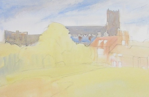
Finished painting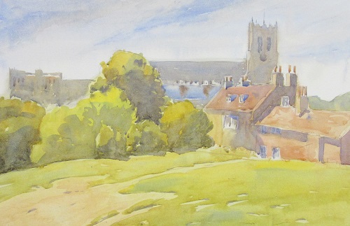
Details of the painting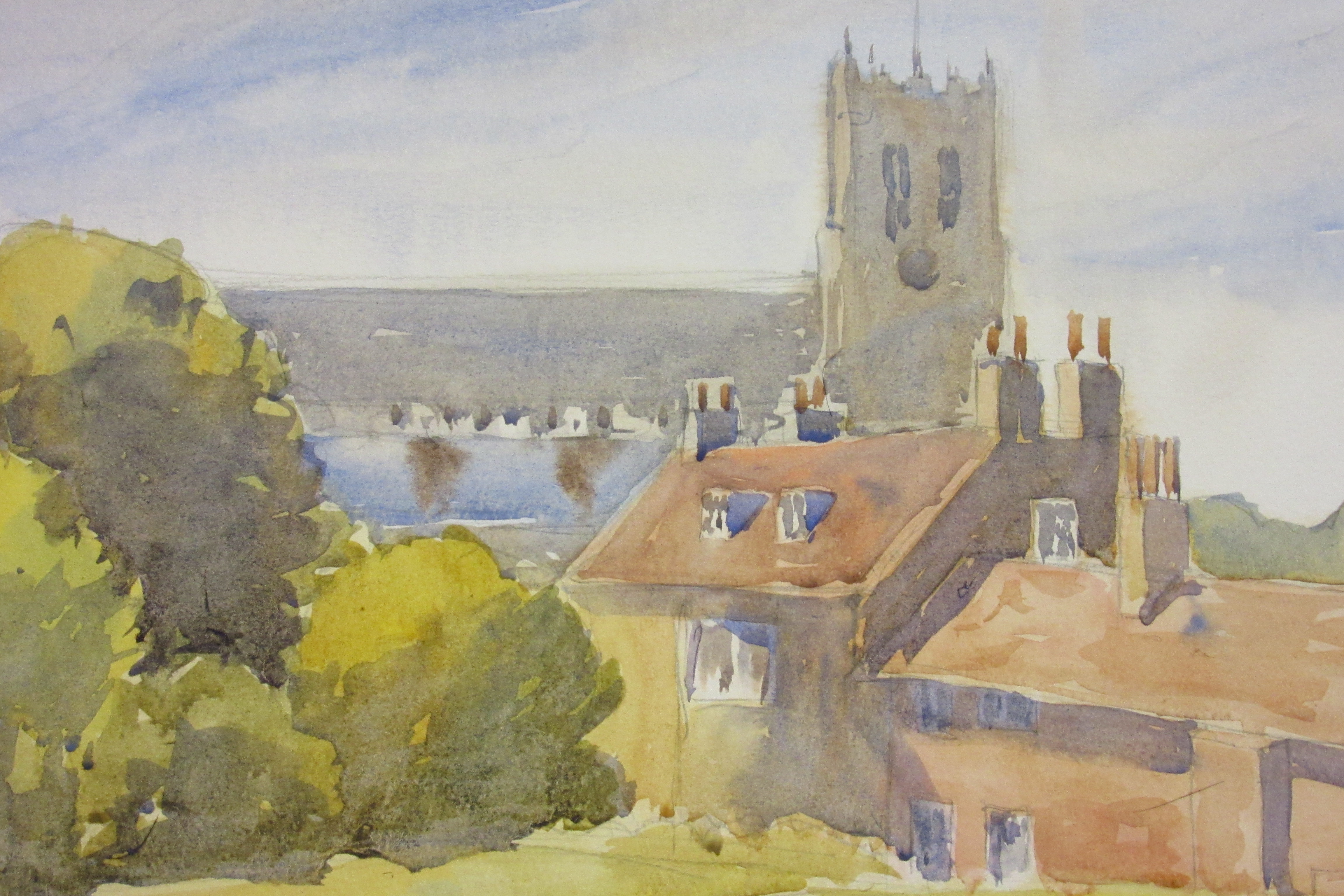
David’s website is: www.davidwebbart.co.uk
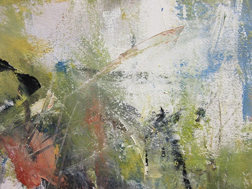
 Tony Homer – Mixed media – Abstract Landscapes
Summary:
Tony prefers to go out in the landscape and paint. Usually paints with acrylics on Saunders Waterford 300mg paper, it’s strong paper that allows Tony to scrape and manipulate his paintings. He starts with a water wash and then add acrylics out of the tube thinly on the paper. He uses contrasting colours to make it abstract, painting solid blocks of colour to develop abstract shapes. He likes to use large size paper/canvas so he can freely draw lines and patterns. When the colour wash is dry he will use a graphite pencil to draw his landscape. He then uses several flat brushes to draw lines and create his landscape. Tony doesn’t use a specific brand of acrylic and prefer cheap acrylics and brushes to create his artwork. He usually has several paintings on the go at the same time and uses details he likes in one painting in others. He sometimes uses medium (glaze) gloss and matt to create a creamy texture to his paint. Tony doesn’t like mixing paint and usually take colours straight out of the tube, he manipulate his paint and create texture by scraping the paint with the back of his brushes. He uses Prussian blue, light blue permanent, vermillion, yellow, pink, white & green.
Half way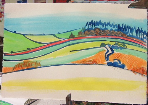

Final painting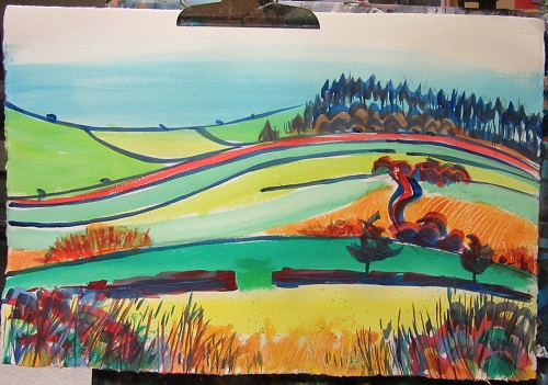
Details of foreground 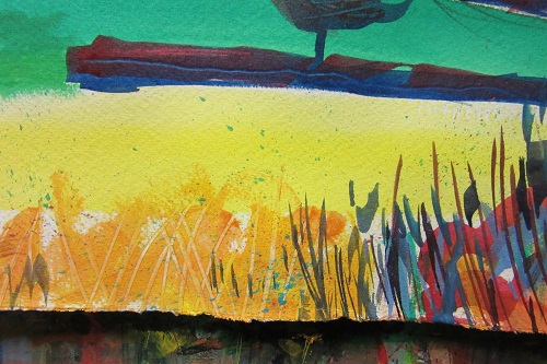
Tony’s website is: www.coroflot.com/tonyhomer/portfolio
 Stephen Foster – Freely painted landscapes with a palette knife.
Summary:
Stephen’s aims are simple: realism is not enough. “I want to paint as intensely and expressively as possible”. His approach when painting is to look for accidents and random events which can make the painted surface more evocative and exciting. It is through these chance events that deeper meanings can reveal themselves and a painting can come to mean more than expected. For Stephen, a painting cannot really come to life without these chance events. For Stephen painting is an intuitive thing. Conscious thought is useful up to a point, but there comes a time when the unconscious takes over and the painting starts to become something in and of itself, let that go; only then does a painting have a chance to become complete. Stephen use a palette knife much of the time as it can give an expressive random mark making quality to the paintings. Stephen uses a simple pallet of colours, Prussian blue, burned sienna, titanium white, yellow ocre, Van Dyck brown and magenta in acrylic and oil paints. His priority is the tonal qualities of dark and light, creating rhythm with shapes rather than line drawing.
Landscape in acrylics

Seascape in oils

Stephen’s website is: www.stephenjfoster.com
 Rebecca de Mendoca – Pastels
Summary:
Rebecca works extensively with pastels but also uses pen and ink. She works in plein air and in her studio and sometimes inside buildings. She tries to tell a story with her work, to make it come alive. Rebecca uses a contour crayon for structure sketching and will then use pastels to create movement and depth. She uses mountboard that has been primed with Colourfix Primer, she mixes pastel on the surface and uses the side of her hand to smudge areas in her painting. She starts to use the pastels loosely as no detail is required yet but will then focus on a particular detail in the painting. She draws lines in different directions to create movement. Rebecca will work from top to bottom with some painting and others from the centre to the edges. She’s interested in darks, lights and structure rather than colour. She will use layers of pastel to create the lightest light and darkest dark and to create dynamism in her paintings. Rebecca doesn’t use fixative on her work, she will hit the back of the board to remove excess pastel before framing.
Rebecca’s website is: www.rebeccademendonca.co.uk
 Kate Cochrane – Acrylics
Summary:
As a painter Kate transforms what she sees into a mosaic of shapes and colour, considering hue, tone and composition. Kate paints in layers and will use different mediums at the same time to create different effects. She works mainly from photographs which she manipulates on the computer to create blocks of colour and to make it abstract. Kate enjoys painting on board which she treats on occasion with gesso prior to painting, she will sketch her design using chalks as they’re easy to remove . She mainly uses complimentary colours to create depth, for this process Kate uses a colour wheel which is hard to do and need a lot of concentration. She will use lots of colour on top of other colours as Kate paints in sections and will cross over in already completed sections to make the painting merge together and not stand out. She mainly uses a pallet knife to scrape the paint over the background colour (under painting) and works slowly to create structure and depth. When she paints woods & branches Kate will paint the background colours in between the branches which gives the effect of a stained glass window. Although she works from photographs she will visit the area she paints to create a connection with the painting afterwards. Kate use of colour is instinctively and uses raw umber, earthy filo green, white, burned umber mixed with yellow to create a variety of greens, ultramarine, cobalt and cadmium red. She will rarely use black but prefers to use other colours to create darker colours.
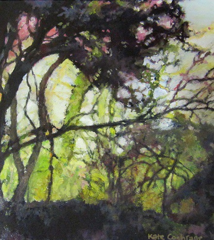
Kate’s website is: www.katecochrane.com
 Laurence Belbin – Creating atmosphere in oils
Summary:
Laurence Belbin is a painter of light and atmosphere. He has a fascination with sunlight, especially on water. His landscapes and interiors also sparkle and his handling of paint is both sensitive and expressive. Laurence prefers to paint plein air, he usually spends 1,5 to 1,75 hours on a painting so can make up to 8 paintings a day. He prefers to use a reduced pallet of cadmium yellow, ocre, virilion green, white & cadmium red. He sometimes use colours straight out of the tube. If he prefers to have the sketch come through he will use thin paints rather than add the paint on thickly. He rarely uses photo’s as his work responds to the atmosphere of the day which you cannot get with photographs, he will make drawings as for Laurence the drawing is the essence of the painting. He likes to work on the whole painting rather than details, he will work from dark to light the opposite of watercolours. Laurence does return to his paintings he did in plein air to finish of details in his studio as when in situ he needs to work quickly to capture the moment.
 Finished painting
Laurence’s website is: www.laurencebelbin.com
 Jim Patterson – Two Rivers Paper Company
Summary:
Jim is a 4th generation paper maker and owner/manager of the Two River paper company that makes traditional rag watercolour paper using an ancient watermill in the deep Somerset countryside. All the papers are produced to archival standards using pure Exmoor water from the mill’s own well and speciality fibres. These are principally cotton and linen flax but other materials such as hemp, esparto, seeds, flower petals and recycled rag are used to impart special characteristics. These fibres are beaten in water for up to four hours to develop the strength of the fibre and internally sized using ph neutral ‘Aquapel’. For coloured paper, lightfast and permanent pigments are added at this stage. The sheets are formed individually by craftsmen using traditional English hand moulds and deckles giving each sheet characteristic ragged edges and a strength. Each sheet is laid onto cloth felts unique to the mill and pressed four times to impart the gorgeous knot texture. Surface sizing with gelatin and slow airdrying high in the rafters of the mill loft complete the process. Jim then showed us that it is not necessary to use white paper to create intricate highlights, slightly cream or even coloured paper will do, by just using body of colours, whites can be created. Two Rivers paper can also be used for an array of other mediums like pastels, oil paints, gouache, charcoal, etc… . It was an interesting and rather noisy demonstration.
The Two River Paper Company’s website is: www.tworiverpapers.com
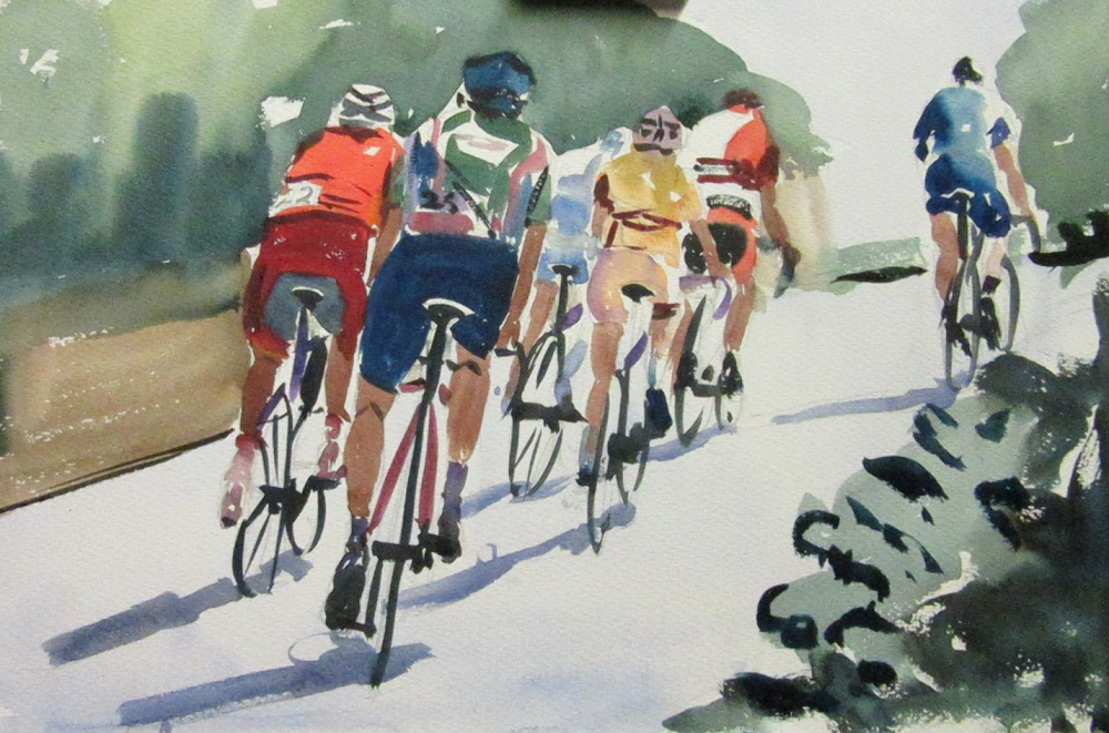
 Paul Weaver – City Scene with people in watercolours
Summary:
Paul start with a tonal sketch in charcoal of the scene he wishes to paint, using cropping tools to find the right composition. The reason to make a tonal sketch is to 1. sort tones, 2. verify your composition & 3. draw what is in front of you. He will firstly sketch the bigger shapes, then continue with medium shapes and finish with the smallest shapes. He tries to capture a sense of light and atmosphere, Paul does not remove any lines he has drawn as they are part of the graphic interpretation. For the main painting he uses rough Bockingford 140lb paper, Paul likes the rough surface as he looks for textures which can be easily achieved with this paper. He draws the same sketch with a 4B pencil sharpened with an edge so different lines can be drawn. Again looking for shapes but draw as little as possible instead use the paint to draw the shapes. The tonal sketch is fast forwarding the process of drawing the subject in pencil before painting. Paul starts with the sky, wet the paper with a Rosemary brush size 30 and then add colour washes over the whole painting. This size of brush is vital if you work loose and fast. Paul uses a variety of colours on his palette from warm to cool colours like Winston Yellow, Viridian, Raw Sienna, Permanent Rose, Cobalt Blue to mention a few. Move through shapes fairly quickly so you don’t get stuck with details. Underpainting is essential to judge colours against colours instead of white paper. Look for negative and positive shapes, again start with big shapes to smaller (usually people) leave until last. Then add the shadows to people, the shadows are a darker colour of the existing surface (ie asphalt) not just black or dark brown.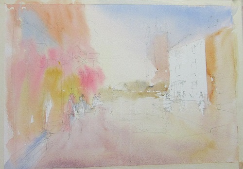 Half way
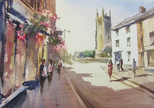 Finished watercolour
Paul’s website is: www.paulweaverart.co.uk
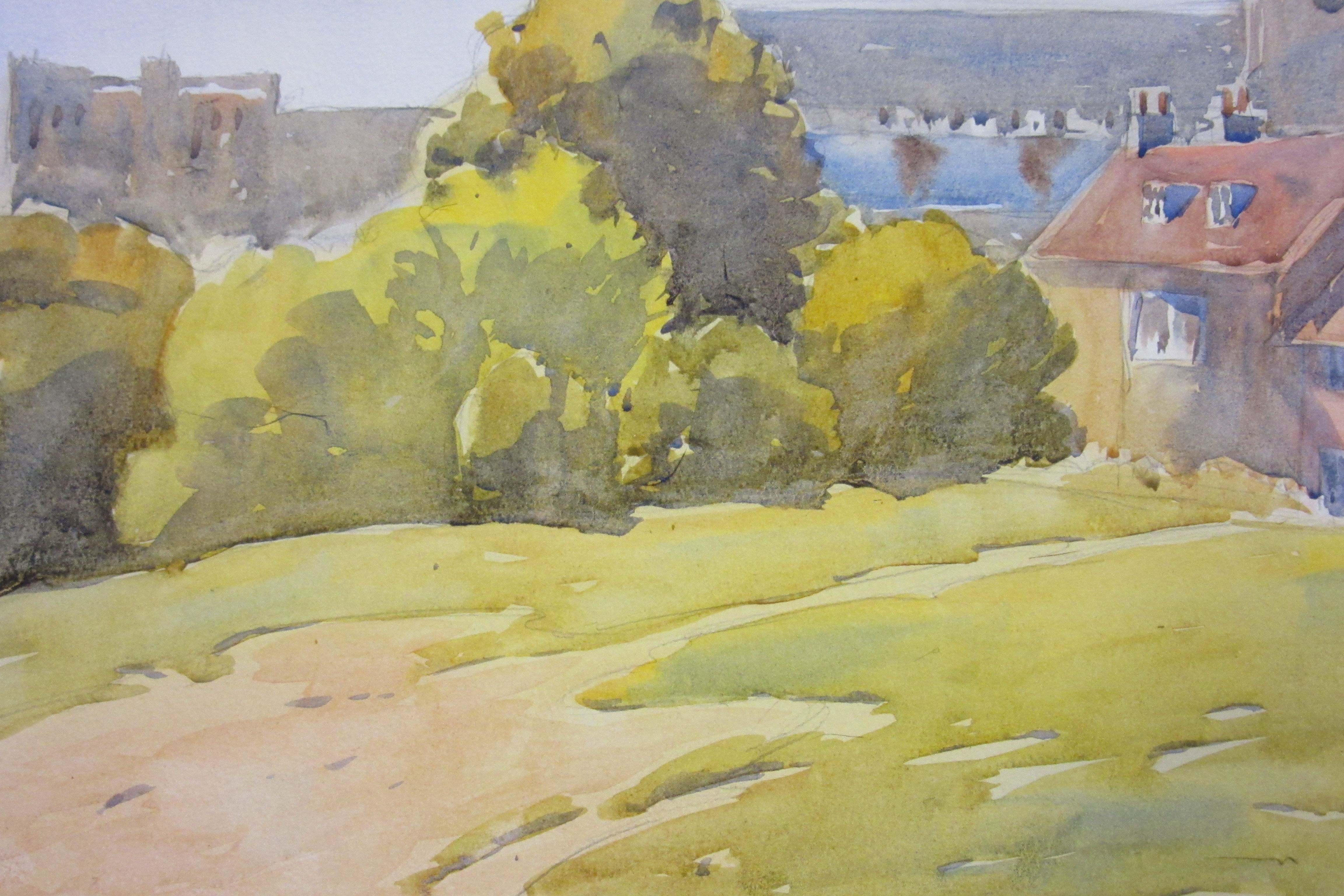
 Ray Balkwill – Every Picture tells a story
Summary:
Ray is a well-known West Country artist whose watercolours, oils and mixed media paintings are much sought after. Born in Exeter in 1948, he graduated from Exeter College of Art, thereafter making a career in advertising as an Art Director. He thrilled us with stories of fighting the elements, tide, weather and animals whilst painting & sketching. Ray’s style is very fresh which he achieves by using light, contrast, tones and shapes in his paintings. He starts with a black & white sketch which is the foundation of his painting using charcoal, pencil, felt tip pens or biro to create the mood of the picture. He will then use different media to create the painting in colour using his black & white sketches, he tries to avoid using photographs where possible. He uses watercolours, oils and acrylics to create backgrounds and finishes the painting with pastels to create depth and structure. He uses flat washes, dry paint, tinted paper with gouache and water colours and masking fluids for whites. Ray’s motto is “Paint what you love and love what you paint”, Ray’s top tip is working to a time limit no more than 2-3 hours maximum to keep your painting fresh. It was a very entertaining, instructive and enjoyable lecture.
Ray’s website is: www.raybalkwill.co.uk
Marilyn Allis – Loose and free watercolours
Summary:
Marilyn Allis is a water colour artist working in a loose & impressionistic style, using strong vibrant colours capturing movement, and the energy of a scene. Marilyn uses rough cotton watercolour paper 90 pounds weight to create her paintings. She uses round brushes with very defined points to create details in her work. Marilyn start with a background wash and then add colour by painting the shapes of her subjects. Once they are dry enough she will add shadows to make her subjects stand out and create movement in her paintings.
Marilyn’s website is: www.marilynallis.com
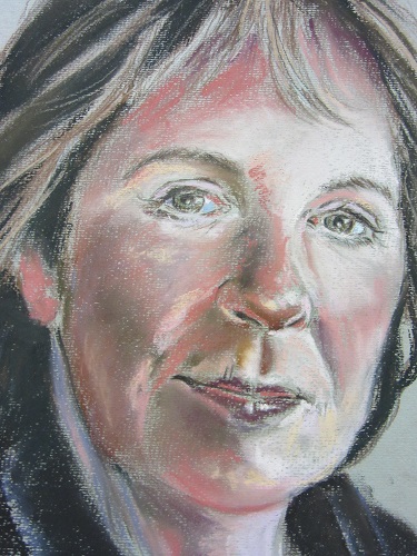
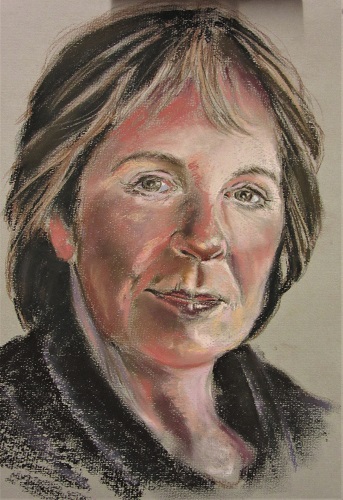
 Tilly Willis – Portraits in oils
Summary:
Tilly paints with a basic colour palette of titanium white, cadmium yellow, lemon yellow, viridium green, crimson & vermillion red. She mixes all these colours to create her darker shades including black. Limited colours makes the painting cohesive, too many colours would make the painting chaotic and busy. The canvas is prepared with a wash of a complementary colour depending on the subject. She roughly sketches the face with a flat brush, always looking at the shadows and shapes of the face, it is painting a jigsaw of lights and darks. Tilly uses big flat brushes which gives her loose strokes and provides her with a sharp edge to accentuate parts of the portrait she is painting. When most of the base colours have been put down Tilly uses lighter colours to highlight areas and bring out details of the face.
 The finished portrait
Tilly’s website is: www.tillywillis.com
 Steve Hall – Watercolour in the style of Ted Wesson
Summary:
Steve likes to paint with shapes/marks rather than colour in a meticulous drawn picture. He will start his paintings with a basic pencil drawing. He then uses a big loader brush to cover the whole picture in a very light wash. Then he start to use mid tones to describe layers in his painting, concentrating on the play between light and dark. For reflections in water, Steve pulls down the paint and then move the paint around horizontally to blend it all in. For tree branches, he uses the paint straight out of the tube or uses a pallet knife or nail to scratch branches is wet paint. Steve uses a squirrel brush for the whole painting using the wet in wet technique to create beautiful skies and backgrounds.
Steve’s website is: www.stevehallartist.co.uk
